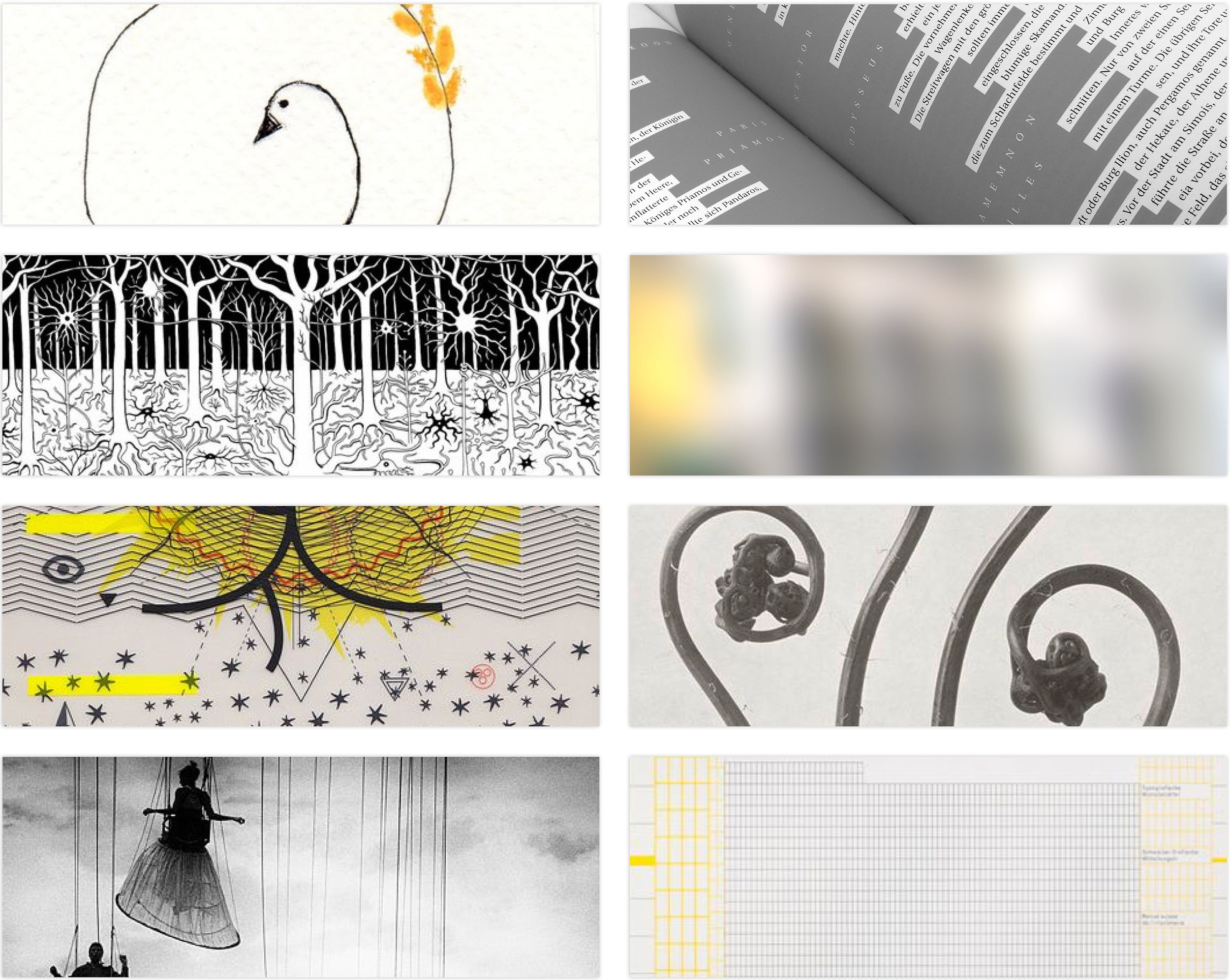
A conceptual book with defined parameters and limitations. Topic of choice is expressed strongly with typography and minimal colors. Surface vs Depth can be either one or both and embraces the light and the dark. One cannot exist without the other.¶ Justified type is neutral and was selected to represent “all things being equal” until we make that one pivotal decision that either elevates, remains the same or directs the momentum downward. Most beings have defined choices based on the outcome, overlooking the process entirely. This book focused on the path taken after the decision and is then highlighted throughout.¶ A constant web that connects us to experiences, words and memory. The only breaking points are the time of reflection and looking outward through windows that aren’t bias and therefore take up the entire spread. Cross paths with different versions of yourself and continue knowing you don’t have to define and resolve in order to find your strengths upon the surface and in the depths.
Limited to the usage of three colors, the focus of the beginning stages explore a visual duality with color and imagery. Extreme differences were envisioned that relied on one another for contrast and layout while also introducing a sense of balance as a relationship.
Stripping away the imagery and filling in the blanks with content placement is sketched out. The roughs show different approaches to communicate how the book spreads could convey the spectrum of contrast and keep to the message with type usage, paragraph breaks and layout.
Once design spreads were approved, the book was printed and bound professionally. An in-house photography studio was then assembled and the captures were taken for promoting senior portfolio and website.
A comprehensive house of brands distributed as/or under Sphere Store with developed branding strategies and creative designs for all product labels. Sphere Store is transparent and takes pride in the intention and empowerment of what you see is what you get. There is no hidden agenda, form meets function and that particular essence can be found in every line. ¶ Each private label, such as BON is driven by key attributes and has a unique typographic mark based on a customized identity and is packaged to showcase it’s contents. ¶ BON is marketed as a high end artisan bistro line with dedicated chefs and handcrafted ingredients which consist of baked goods, pastries and dry foods. A French theme, hands on dining experience and the comforts of home makes this line a contender when consumers choose homemade quality and distinct taste.
A comprehensive house of brands distributed as/or under Sphere Store with developed branding strategies and creative designs for all product labels. Sphere Store is transparent and takes pride in the intention and empowerment of what you see is what you get. There is no hidden agenda, form meets function and that particular essence can be found in every line. ¶ Each private label, such as NOMAD is driven by key attributes, has a unique typographic mark based on a customized identity and is packaged to showcase it’s contents that are geared towards more specific interests. ¶ NOMAD is marketed for the avid traveler or novice and is a cross over interactive label that appeals to all ages, entices with scenic photography and is committed to the buyer experience while functioning in a way that promotes brand loyalty.
Claiming itself to be the “most consumer-friendly airline” won’t change public opinion regarding this discount carrier. Currently rated at 2-stars, Spirit Airline headlines as the top U.S. Carrier To Make List Of World’s Worst. ¶ I selected this airline for a brand and reputation makeover after reading such headlines, numerous complaints and their ongoing controversial advertisement campaigns. Their marketing ploy that focuses on negative current events by turning them into slogans was an ultimate fail and such a turn-off ¶ With a complete overhaul, Spirit Air can now announce “We’ve Changed Our Colors” and prove it with guidelines and a new look. The color scheme and re-designed logo mark is inspired by the rising of the sun and taking flight soaring into the blue.
Crystals have a natural frequency, as do humans and when the two are combined, an entirely new frequency is generated - - a new language perhaps. This experimental conference topic takes it a few steps further by altering these components and using the language to regenerate the earth. ¶ Harmonic ratios and variations that balance nature and humanity with technology. If vibrations stabilize our energy patterns and bring our body back into a state of balance and crystal-like proteins take in energies and transform them into a biologically active signal, then let’s explore and discuss a universal language of frequency patterns that are influenced by all of creation.
A store created from the ground up by a design team which caters to specific demographics and has made a study of the direct impact involving purchasing power and selection of millennials.¶ Sphere Store is transparent and takes pride in the intention and empowerment of what you see is what you get. There is no hidden agenda, form meets function and that particular essence can be found in each line. sphereWEAR, and sphereLIFE are by design and intent, committed to the buyer experience while functioning in a way that also promotes brand loyalty. ¶ Each brand label is driven by key attributes with essential one syllable descriptors that are used in conjunction with what the store encompasses and has a unique mark based on that of a circular shape. Sphere Store is a brand label in itself and also has three private labels BON, NOMAD and THIS which are geared towards more specific interests.
This project was unique in that teams were formed at random to take on the ground up creation of a store including brand and private labels.
A comprehensive house of brands distributed as/or under Sphere Store with developed branding strategies and creative designs for all product labels. Sphere Store is transparent and takes pride in the intention and empowerment of what you see is what you get. There is no hidden agenda, form meets function and that particular essence can be found in every line. ¶ Each private label, such as THIS is driven by key attributes, has a unique typographic mark based on a customized identity and is packaged to showcase it’s contents that are geared towards more specific interests. ¶ THIS is an extremely quirky — in your face personality label that shouts to the consumer, entertains with bold highlighted quotes/phrases/instructions and is committed to the buyer experience while functioning in a way that promotes brand loyalty.
The creation of an iphone app that is designed to pair the compatibility of people with animals. Many times, more so than not, instant gratification and the cuteness factor become the determining aspects of what people hope is to be a life-long relationship with a furry friend. ¶ When important characteristics aren’t considered, the outcome is discouraging and can even be traumatic. Pet Pair aims to resolve, fill in the blanks and ask the right questions. ¶ Future animal owners are encouraged to reflect on their lifestyle, consider personality traits, options for going about adding a new animal to their home and then recognize how other key elements contribute to building a positive experience.
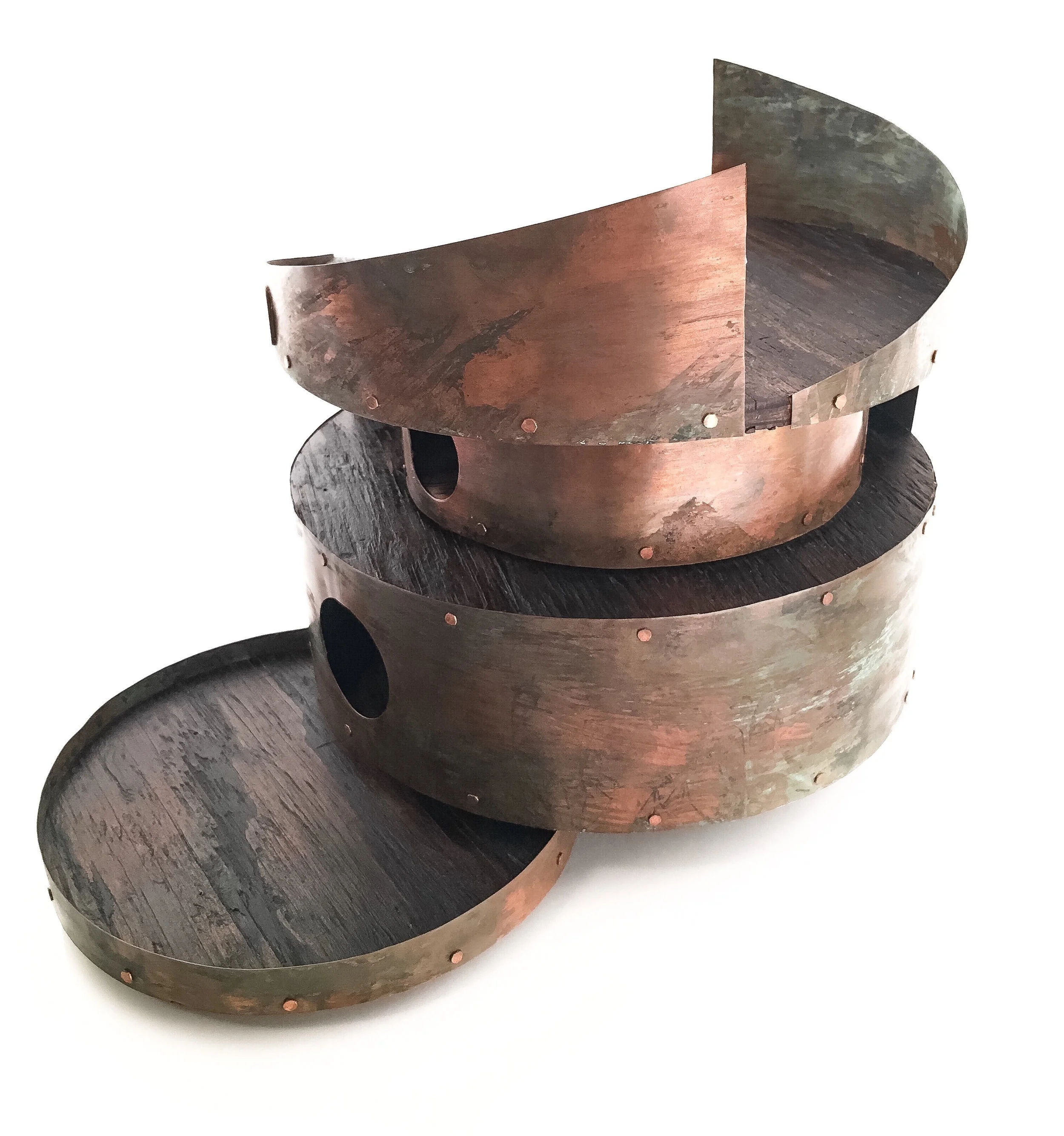
Inspired by the number 8, pairs and it’s significance within Feng Shui perimeters - - This birdhouse project is based on a fictional gallery that draws it’s strengths through awareness within the community and towards the environment. Selected artists who are committed to designing high-end pieces auction off their works which are geared towards a Feng Shui lifestyle. ¶ Hands on crafting is displayed encouraging harmony within the designated spaces and embraces movement of Qi energy at a balanced pace among the five elements. Each artist commissioned creates subtle variations of a specific piece that is available for purchasing by the public and will showcase for two months. ¶ Within that time frame, the majority of proceeds are then donated to a charity of the artists choice. The rotation is over a 12 month calendar period and gives the artists an opportunity for donating towards 24 individual charities while also bringing in a new approach to artistry. The gallery loft itself is sectioned off into 8 parts/sectors and focuses on the Feng Shui properties of coordinates, color, shape and size. The birdhouse design caters specifically to love birds and brings luck and balance to what or whomever may choose to be in a paired setting. Hence, the name M8 [Meyt].
Hand sketch approved rough that supported design brief and objective for the construct of high end sculptures with sustainable and re-purposed materials.
The final two models were then constructed digitally and measured out in 3 dimensions to better understand questions of durability and materials. In selecting, it was important to build on fluid shapes in certain directions that allow energy to expand from a stable foundation.
This visual using SketchUp was presented to convey the vision of how the sections would be fitting together. Since the materials vary, the types of adhesives will also vary and require testing. The sustainable materials will consist primarily of re-purposed copper and wood.
Using paperboard, corrugated sheets and foam board to shape in 3D, the mock-up was then built to strengthen the concept and show that the birdhouse will stand level with layers using heavier materials.
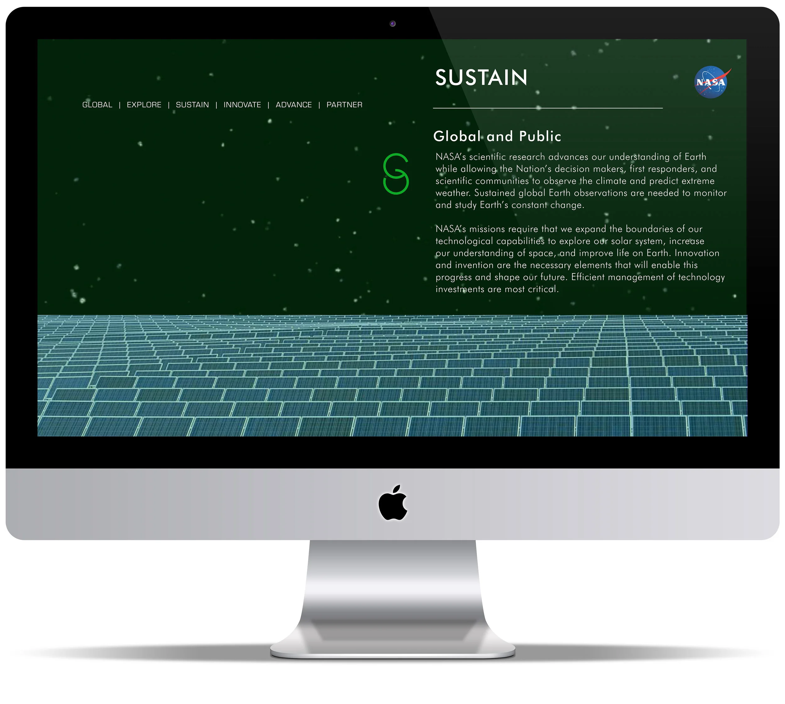
NASA’s overall message conveys the importance and impact of cycles and the relationship between existence and evolution. The agency carries out its work in specific mission directorates: aeronautics, exploration systems, science and space operations. All of which enhance technology, provide information, answer the unknown questions and embrace humanity. ¶ NASA has paired up with many investors and companies wanting to make a global difference. (CSR) Corporate Social Responsibility is compiled of joint aspirations looking towards the future to insure high quality survival. ¶ My goal is to harness the importance of NASA and relay exposure to people in a summarized, influential manner. In order to obtain a well rounded CSR, I have created 6 focal points. These points have intentionally been the target for breaking down information involving this project and are used to show the impact in space and on earth. Together, proving the necessary duality with what we don’t see and what is right in front of us. ¶ By assessing how we absorb information, evaluate the big picture, apply knowledge and pay it forward we can then ensure social and environmental responsibility and learn from behavioral patterns.
Any form of construct that can be read much like a book and has a theme telling your story that connects it’s purpose. A handmade box of times playful elements. Unlock and partake in the challenge which makes a person tick and become acquainted with the correlation of higher functioning. ¶ Designed as cards strung on a chain piercing time, 12 elements for each hour that interrupt or advance when balanced to specific needs for regulating one’s circadian rhythm. ¶ Shuffle and measure what pertains to your personal makeup and adjust accordingly. We all dance to the beat of a different drum and are unique. Our inner workings thrive on a better understanding of ourselves and the elements that influence how we build upon rest and movement.


![M8 [Meyt] LOGO](https://images.squarespace-cdn.com/content/v1/5952ad2b197aea04857039ba/1522895950520-0VCORHFYAOWASVP6K16R/testing.jpeg)